
uFly
I designed the end-to-end booking flow for a fictional airline startup as part of my final project in the UX Professional Diploma by the UX Design Institute. The goal was to craft a streamlined booking experience that reduced user friction and increased conversion rates in purchasing flights.
An airline startup, uFly, needed a seamless prototype for their booking experience as they lift their company off the ground. I applied an extensive UX design process in 9 months to streamline their net-new booking process.
Skip to Solution- Competitive benchmarking
- Online survey
- User interviews
- Affinity diagram
- User journey map
- Flow diagram
- Sketching
- Low- & Mid-Fidelity
- Components
- Interaction design
- Annotations
Research
I used competitive benchmarking, surveys, and user interviews to understand the booking experience from multiple angles. Benchmarking to highlight common patterns in the market, surveys to uncover broader user behaviors, and interviews to locate specific pain points in the journey.
Competitive Benchmarking
How are the more established, bureaucratic airline services showcasing their booking process? What’re the red flags? What do people find most important in booking a flight?
I put two airline services and two flight aggregators head-to-head, analyzing about 20 screens from each booking flow to uncover friction points and design opportunities.
Flight Search — Alaska Airlines

- 1Selecting the one-way checkbox automatically removes the Return date input.
- 2The “From” field does not automatically update based on browser location.
- 3The two hyperlinks lead to the same webpage and do not save any prior information entered.
- 4The drop down carets are not uniform.
- 5The main CTA on the page aligns with the goal, but doesn’t take you to where you’d expect: flight results.
Flight Search — Delta Airlines
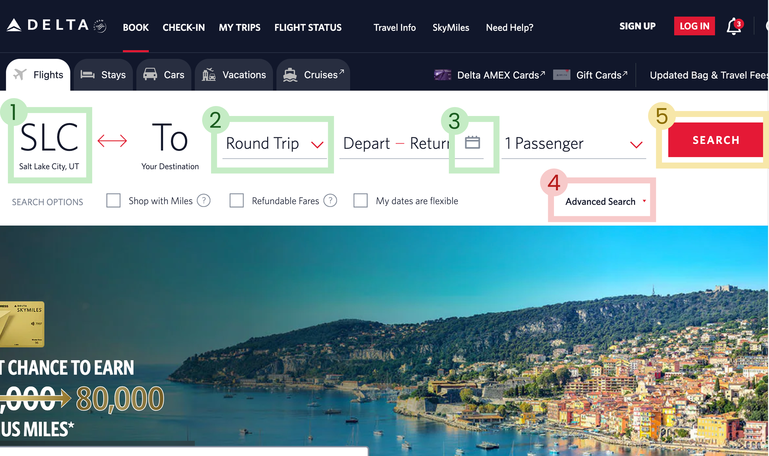
- 1Autofills departure airport from browser location.
- 2All elements are clickable with prefilled inputs, requiring few decisions.
- 3Calendar icon indicates what to expect when opening entry inputs.
- 4"Advanced search" alignment and format makes inputs confusing for "Search options".
- 5Main CTA to search is bright red, but there are 3 other identical buttons on the page the eye travels to.
Booking Summary — United Airlines

- 1Incentive to login before checking out for better experience.
- 2Indication of section start for traveler information with clear iconography.
- 3Optional information is folded into drop-down sections for user to opt-in to info.
- 4Well-organized and clear display and manipulation of bag information.
- 5Poorly formatted information on the page, lack of proper grid use. Overwhelming text info.
Flight Selection — Google Flights
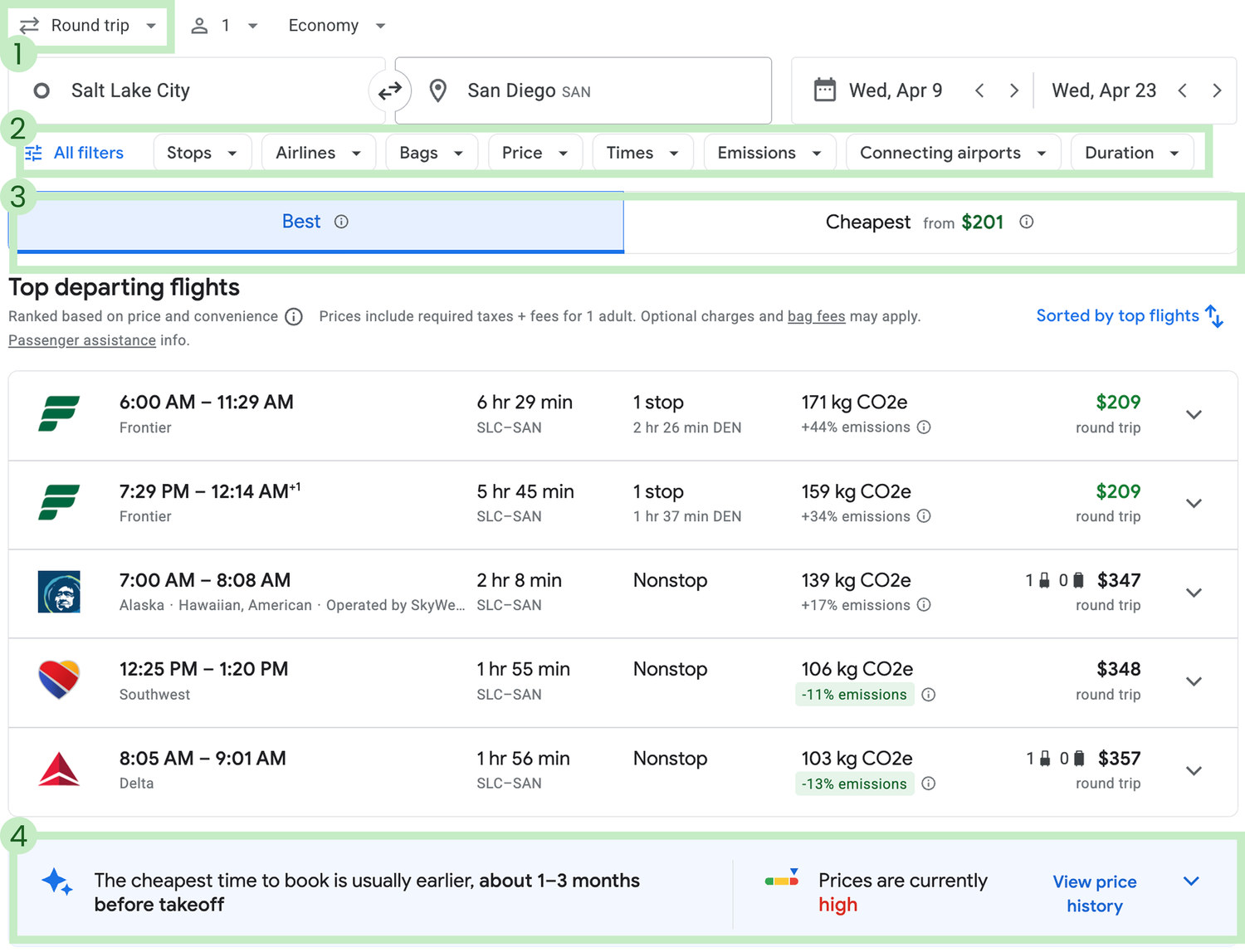
- 1Freedom to update flight changes at the top of the page.
- 2"Advanced flight" search options shown by default to help refine search while retroactively updating flights shown.
- 3Clear tab options viewing "Best flights" by default with a tab for "Cheapest" options, focusing results.
- 4Unique price history view helps users make informed decisions about cost.
Key takeaways from benchmarking:
Prefill as many inputs as possible for the user (browser location, passenger count, etc) to reduce clicks in getting started in the flight search.
The flight search container should take up about 50% of the home page.
Organize the standard information in as few screens as possible: Search, Select, Personal Info, and Summary.
Online Surveys
After comparing competitors' processes, I surveyed 19 people about their flying habits and memorable booking experiences. Here are the key takeaways:
What's the most important factor you look for when searching for flights?
A good brand experience and convenient timing matter more than price. Users want to trust the airline and arrive when it works for them.
Where do users book flights?
Most users still book flights on desktop, suggesting that the larger screen is preferred for making travel decisions.
What would you change about that app or website?
Users want smarter search tools, features like pinning, saving, and getting alerts would streamline their planning and help them stay organized.
User Interviews
Alongside another moderator, we conducted three user interviews, each combining a depth interview with a usability test, to better understand people’s flying habits and how they navigate existing airline sites. We observed users interacting with four services: Aer Lingus, Eurowings, United Airlines, and Lufthansa.
The key pain points our participants were flagging:
“ I can’t find where to book… Oh, I should’ve seen that quicker. I presumed it was going to be further down the page.

“ Is this the round trip price that I’m looking at or is it the single trip price? We’ll have to wait and see I guess.

“ I’d probably go for the Plus and then figure out if I want to do the fast track and lounge access later.
Analysis
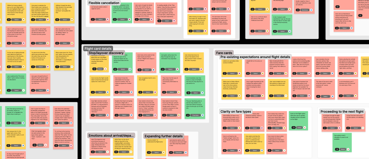
Affinity Diagram
I tossed everything onto virtual sticky notes in a Figjam board and started connecting the dots. Themes like “wait, what’s preferred seating mean?” and “that’s the layover?” came up fast. It was messy at first, but narrowing in on those patterns helped shape a user flow that actually made sense.
Key takeaways from the affinity diagram:
Policies are hard to find and harder to understand, specifically cancellation and refund policies. Users want plain language and quick access to the fine print (if they need it).
Users spent the most time choosing an individual flight. Comparing arrival times, layovers, carry-on options, and prices for each flight took time and mental effort; every flight datapoint felt like it could make or break the decision.
User Journey Map
With key themes in hand, it was time to zoom out and look at the full picture. I built a user journey map to spot where things were flowing and where they were totally falling apart. The map made it clear where the real problems were, helping me focus on what needed fixing before diving into flows and screens.
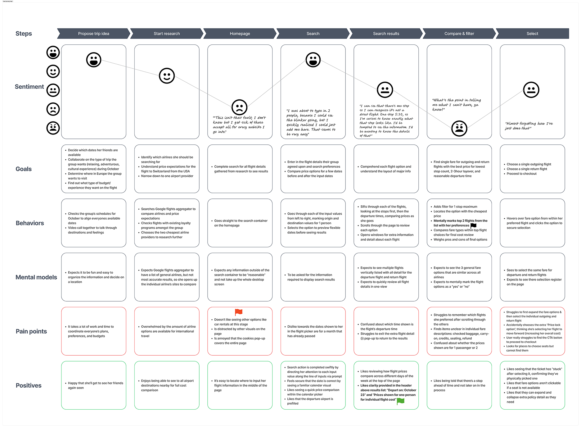
Three pain points stood out from the user journey:
Overwhelming number of options shown at one time
Distracting and unhelpful visuals on the page
Lack of clarity on ticket specs regarding baggage, credits, and refunds
Design
Flow Diagram
To ensure the user flow was going to be as friction-free as possible, I spent some time getting clear about my screens, screen states, and where I wanted the screens to sit in the overall structure of the booking process.
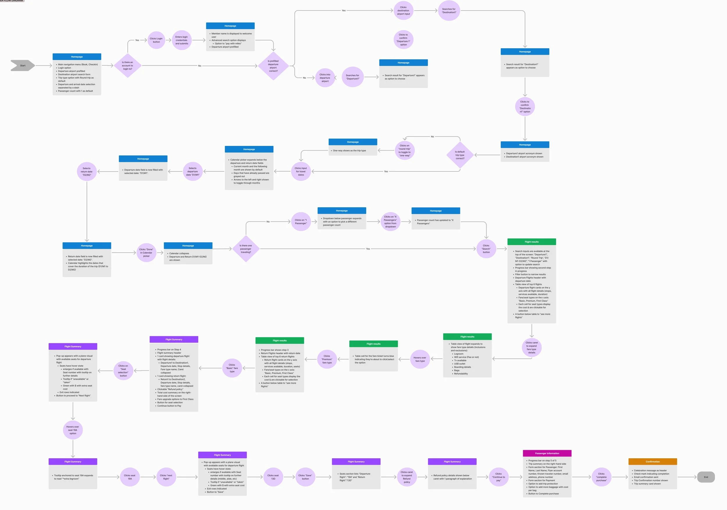
The key takeaway the flow diagram revealed:
60% of the total actions in the "happy path" occurred just on the first screen. That’s a heavy load for users to carry right out of the gate. This validated what I saw in competitive benchmarking too: products that reduce upfront decisions by pre-filling inputs tend to keep users moving forward.
Prototype & Handoff
My goal was to design a booking experience that felt familiar to users, but way less frustrating than the typical airline flow. In my designs, I focused on:
Establishing trust with users
A strong first impression builds trust, and trust builds reputation. Survey results showed users care most about the brand itself, so I focused on design details that signal transparency and care: showing total costs upfront, using plain language for policies, avoiding pop-ups, and guiding users with clear progress indicators.
Ditching the “scavenger hunt” navigation
At multiple points, users weren’t sure how to move forward. That friction adds up fast. I used clear, intentional interaction design to make next steps obvious; no guessing, no backtracking, just a smooth path forward by auto-capturing submissions.
Reducing decision fatigue
Benchmarking and flow mapping revealed users were overloaded with decisions on the first booking screen. To ease that burden, I pre-filled key inputs so users could review rather than decide, and used visual hierarchy throughout the experience to surface the right details at the right time, making it easy to scan, compare, and move forward.
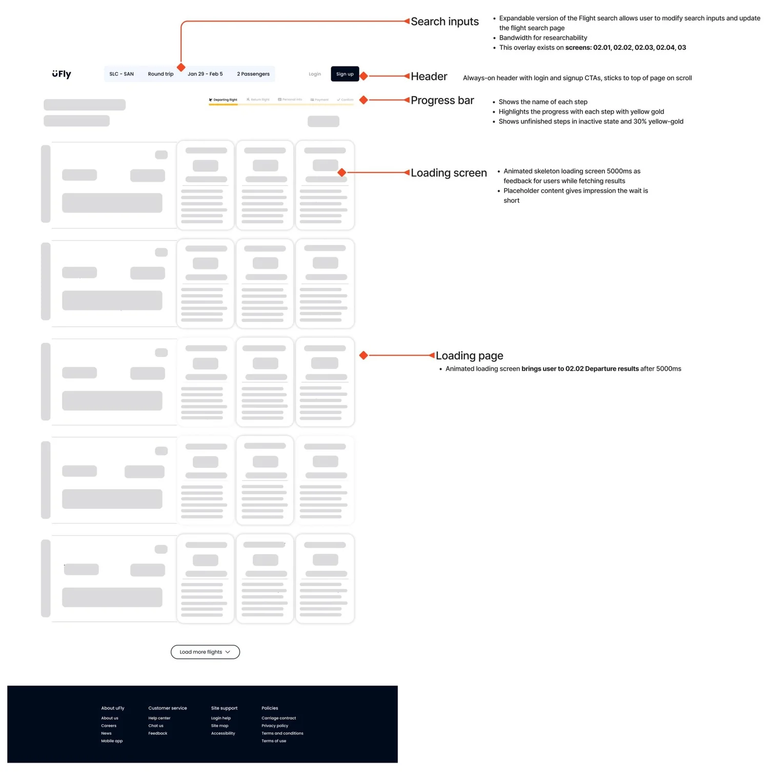
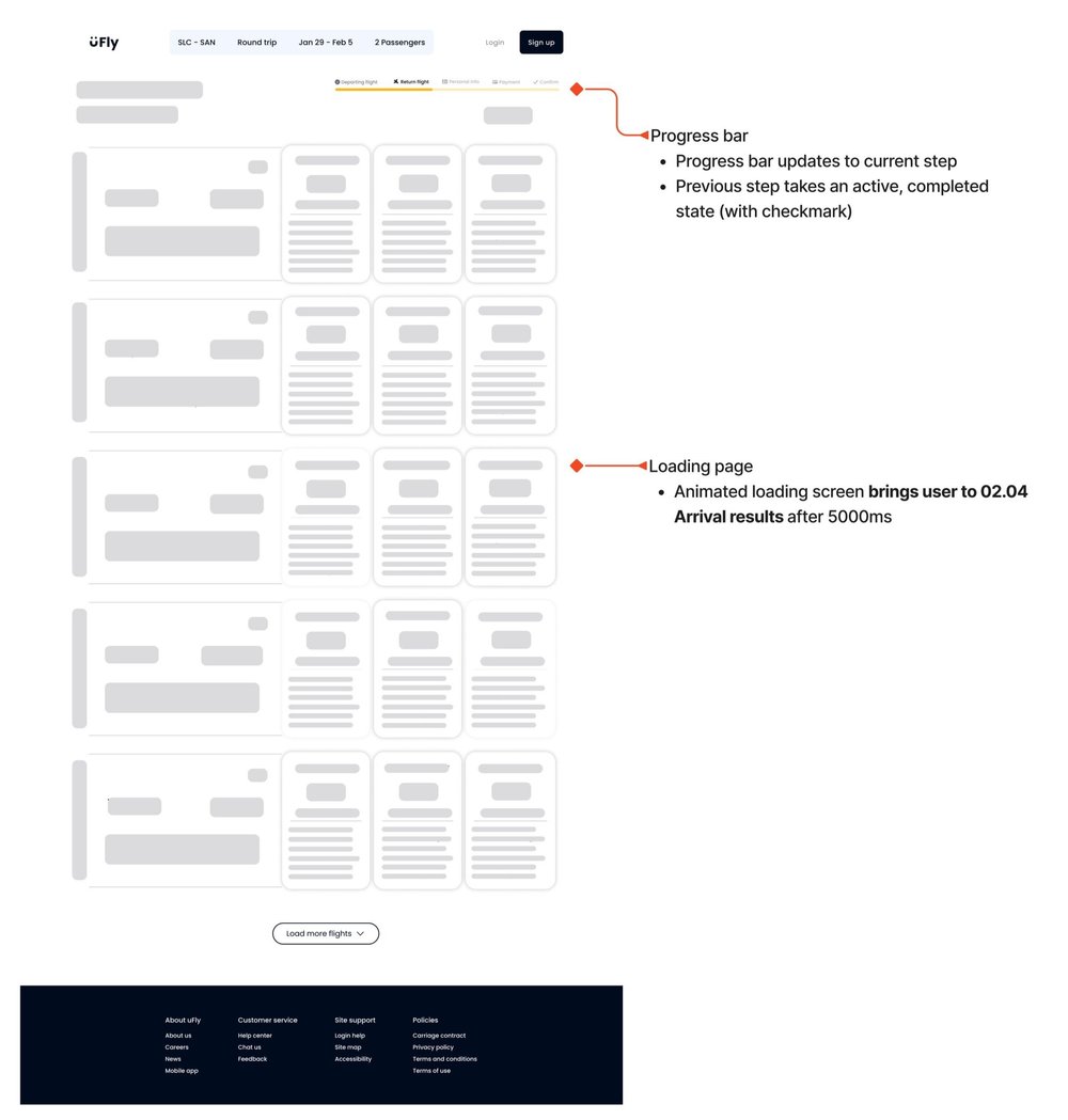
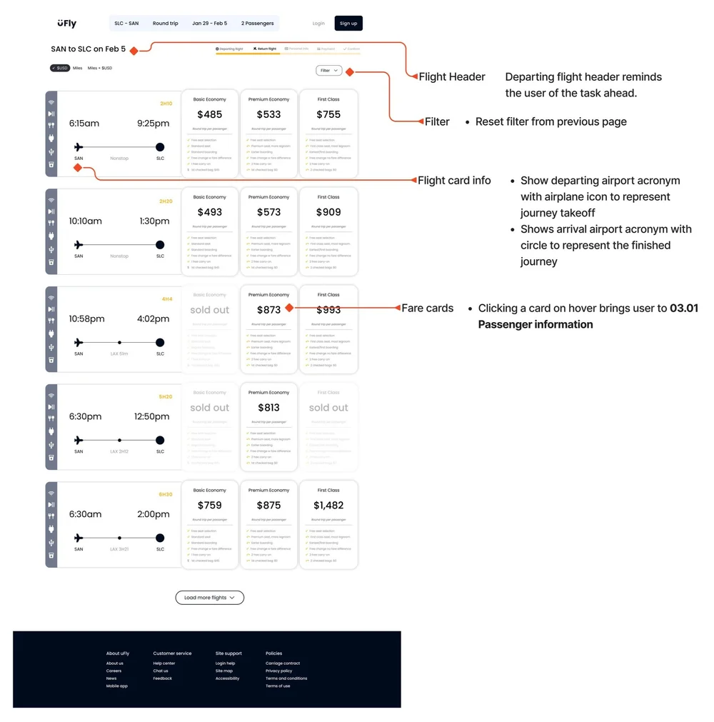
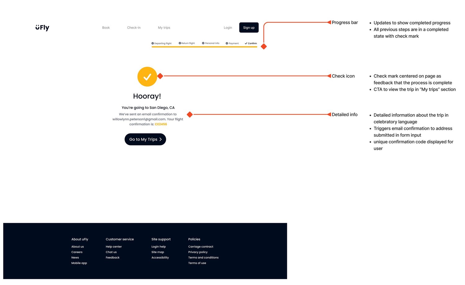
Annotated Screens


Reflection
In hindsight, I would’ve approached my time and AI tools with more intention, especially during the research and ideation phases. With so much qualitative data to unpack, bringing in ChatGPT for theme analysis could’ve streamlined the affinity mapping process (while validating the theme results manually, of course). On the design side, incorporating Bolt.new earlier would’ve helped me explore alternate user flows and refine the interface with more ease. The time saved could’ve been redirected into additional usability testing to create a more validated, user-centered final product.
Back to Top