
Tote
I led a design project for Tote, a social commerce app that helps users track products, discover new brands, and share reviews with friends. Early testers showed signs of drop-off right after signup, so I focused on creating an onboarding experience that helped users find immediate value...and stick around.
During Tote’s Beta launch, incoming qualitative data uncovered the users’ struggle to get started in the app after account-creation. The Tote co-founders brought me in to design an onboarding flow that provides clarity, guides users through key features, and improves overall engagement.
Skip to SolutionThrough user research, I identified two major user types Tote needed to support: those using the app solo (“single-player”) and those using it socially (“multi-player”).

- Wants to plan outfits without staring at their closet
- Needs to check wardrobe while traveling
- Wants to avoid buying duplicates while shopping

- Shares looks with friends for workouts or events
- Wants help choosing what to wear for social occasions
Since the app was still in beta and not widely available, the founders shared a handful of feedback they’d received. These were comments from first-time users after signing up…
The app’s empty states gave hints to the user about the next step, but didn’t provide direction on how to accomplish that next step, leaving users stuck and confused.
What are other apps in the space doing really well? I investigated 6 different apps onboarding flows & brought over some inspiration about what I wanted to bring into Tote’s onboarding flow.

Key takeaways from benchmarking:
Give users momentum, not just an account. Effective onboarding doesn't end at account creation, it sets users up with enough information, context, or starter content so they can immediately engage with the app.
Avoid dead ends after onboarding. Finishing onboarding should feel like a natural springboard into the product. Instead of landing users on a blank page, guide them toward an action, a recommendation, or a meaningful next step that keeps their momentum going.
Using the qualitative research & prioritizing the needs of major personas, I wireframed two approaches to onboarding users.
Given my onboarding work in the past, I am extremely cautious about asking users to do any more than they absolutely need to. I subscribe to the idea that good products don’t always need onboarding flows, so I proposed a concept where Tote leverages purposeful empty states.

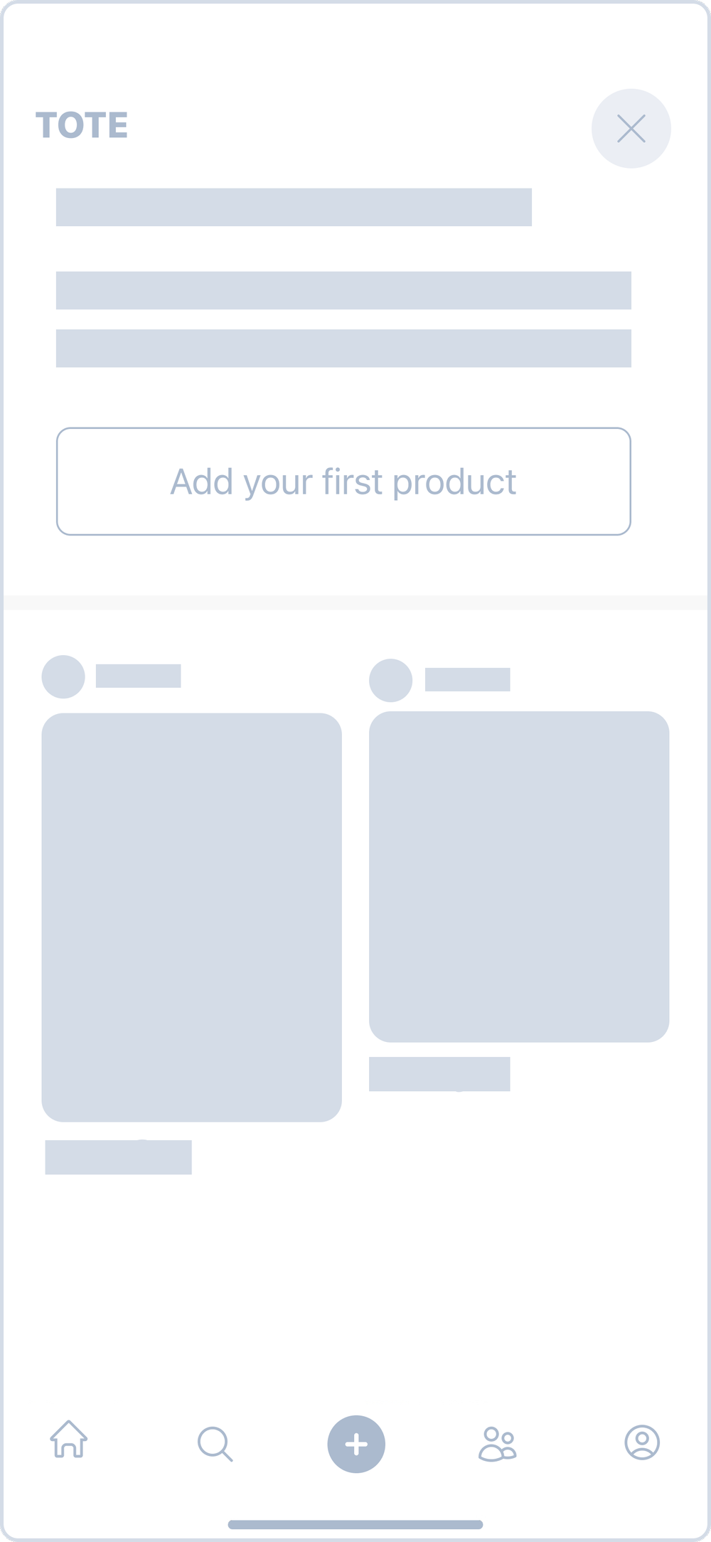
Keep the onboarding flow as short as possible, only including states that are completely necessary for success on Day 1. This will follow common app flows related to general account setup so that when users arrive on the Homepage, they are empowered to jump right in.

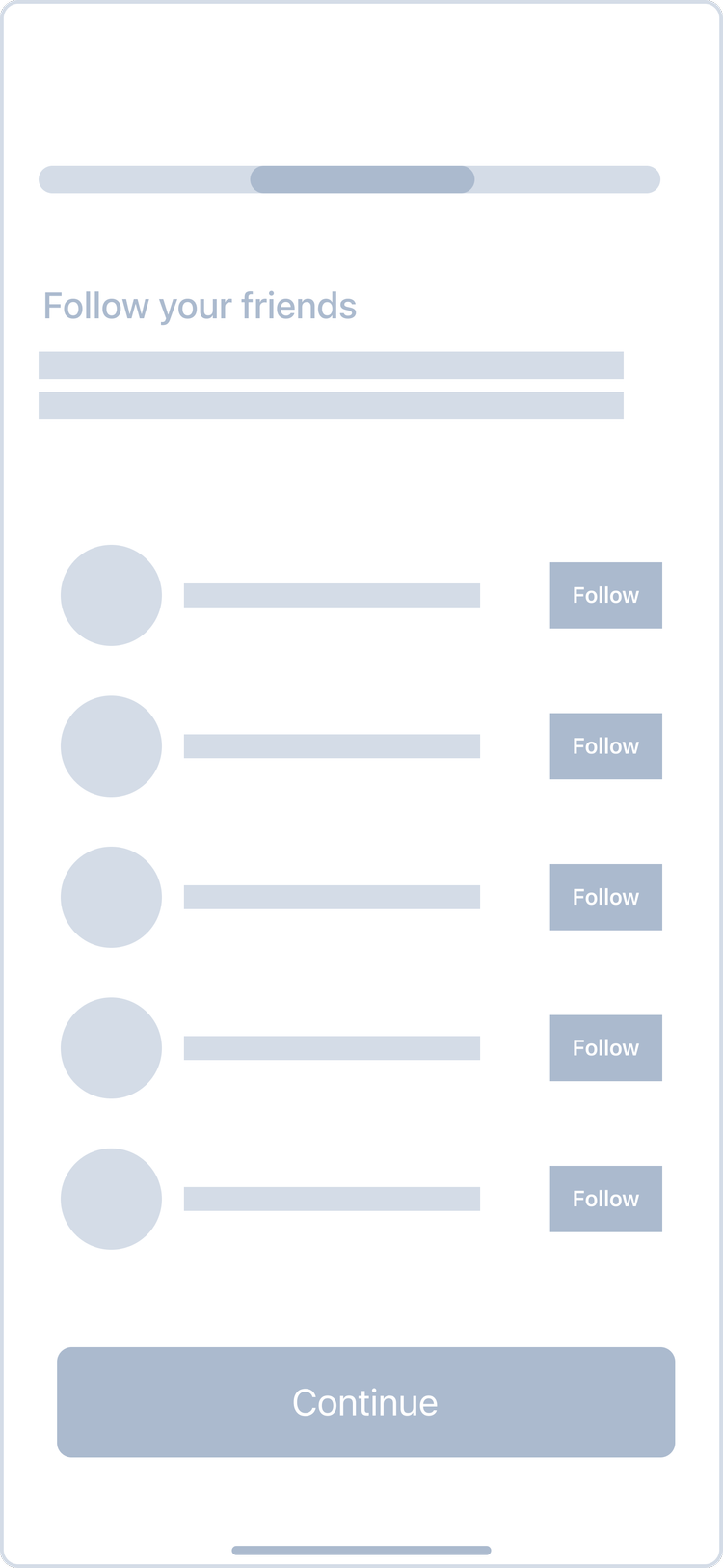
Due to project constraints for MVP, it wasn’t feasible to host usability tests to validate these two concepts. And frankly, Tote wanted the full spectrum of design options in their hands after this project had ended. So, a decision was made to move forward with the second concept: full onboarding flow with empty states.
Typography & Colors
SF Pro Bold / Medium / Regular
Hh Ii Jj Kk Ll Mm Nn
Oo Pp Qq Rr Ss Tt Uu
Vv Ww Xx Yy Zz
1234567890 !@#$%(*).
UI Kit


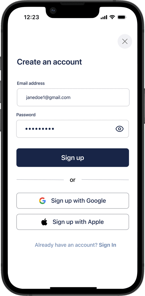
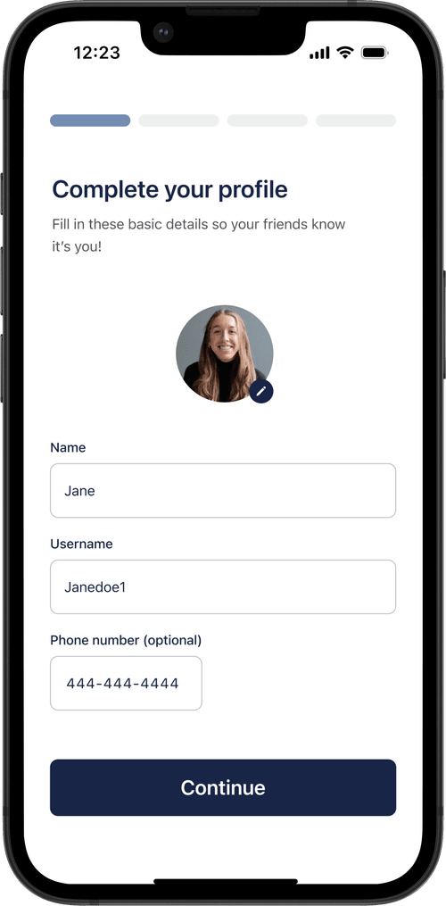
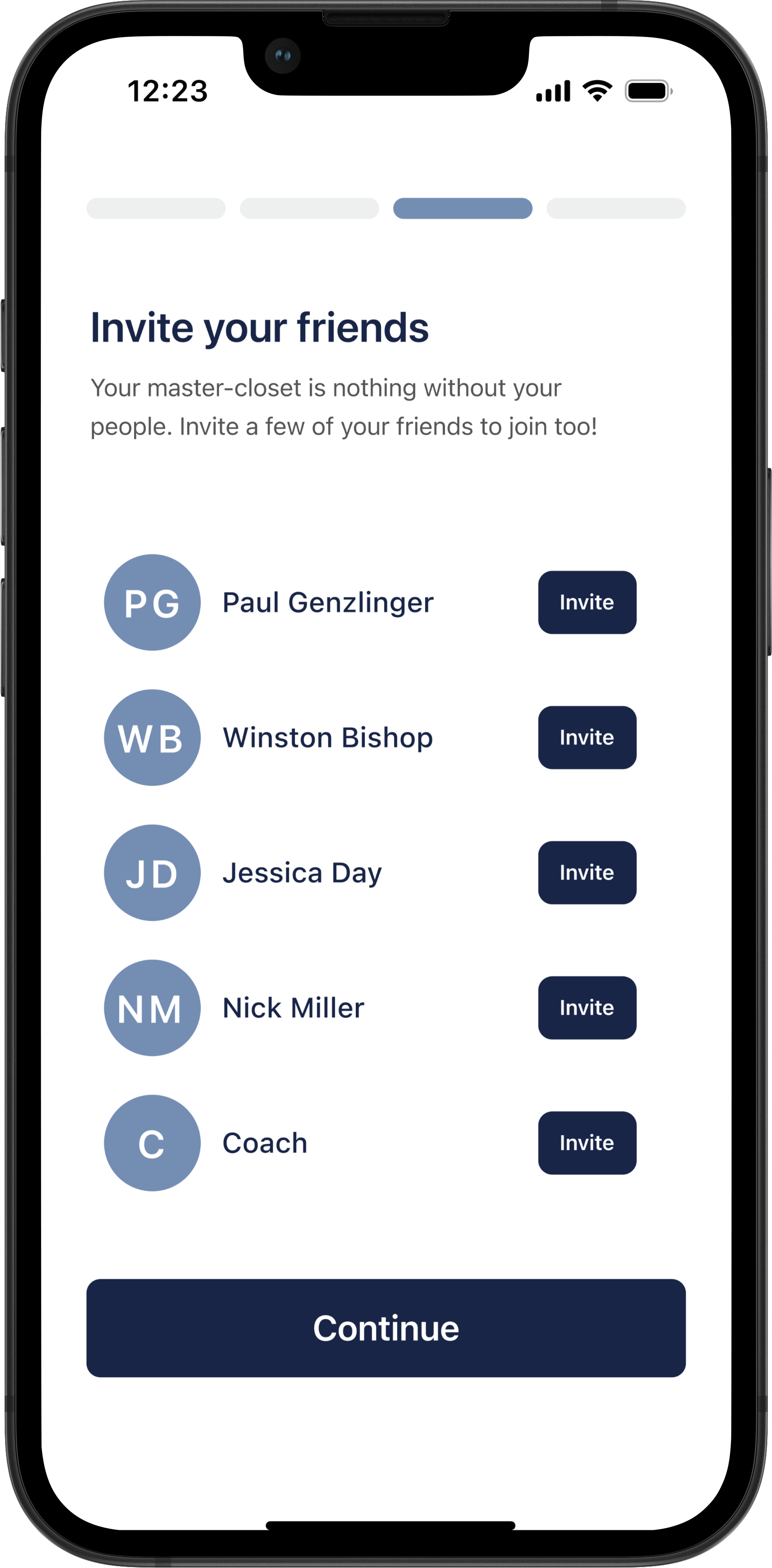
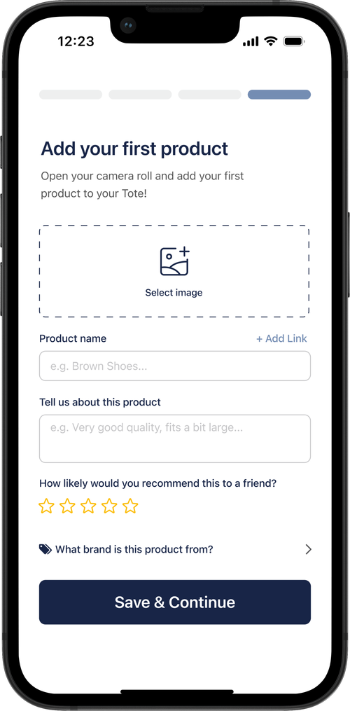
After a few discussions on bandwidth with Tote’s Developer, this was the final deliverable we landed on for the happiest path. Click around if you have ~1 minute! Select "Sign up" to start! Please note: the only programmed sign in options are "sign up with Google" and manual sign in.
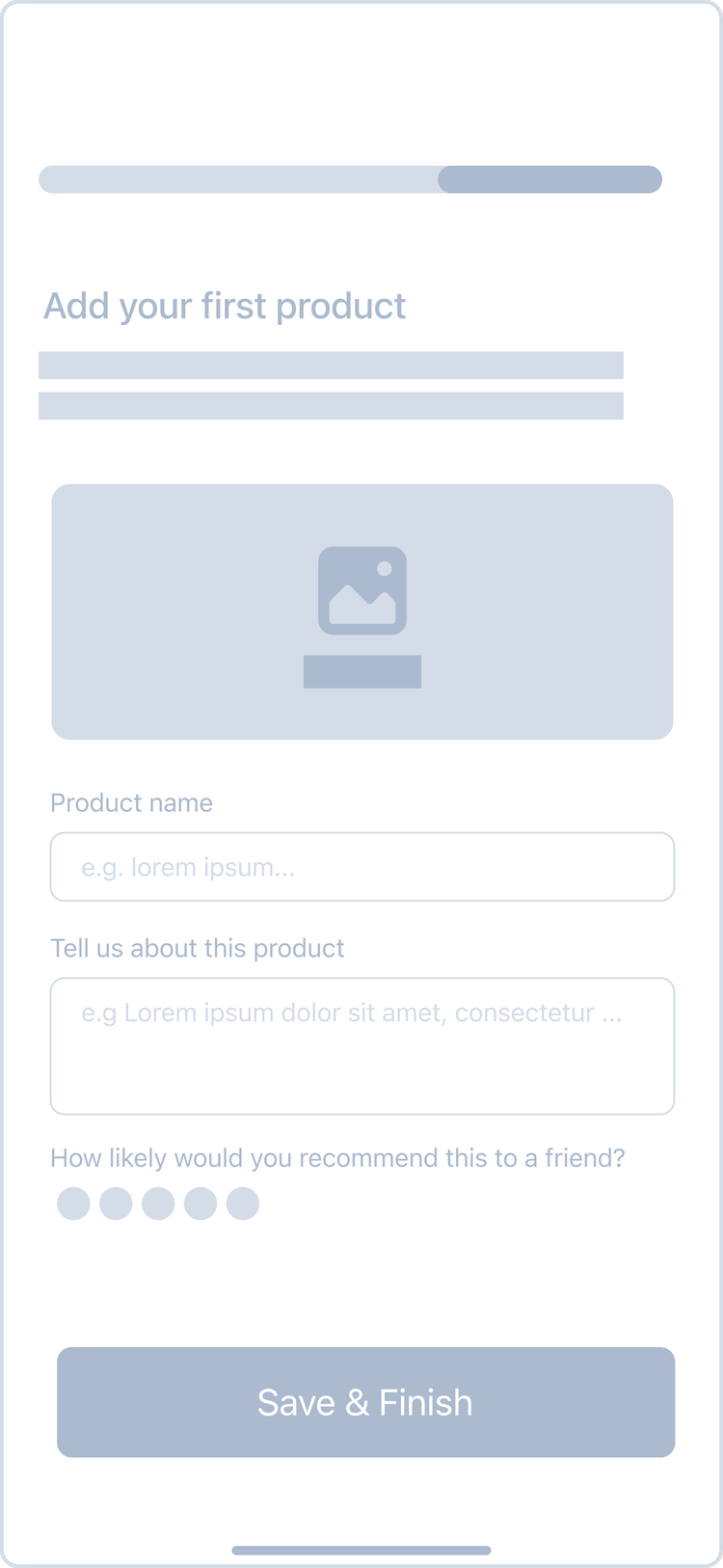
These were some of the final handoff screens for our MVP. I focused on keeping onboarding short and intentional with a dynamic feed.


With more time, I would’ve loved to do usability testing before MVP and dig into how the onboarding actually performed - did users drop off, ask fewer setup questions, or add more products? The focus was speed: we had a month to design a clean, intentional flow, and the app wasn’t yet set up to collect product analytics. But with more bandwidth and further collaboration, I’d have pushed for insights to guide the next iteration.
Back to Top